Our new brand identity

As we've adapted to meet your dynamic needs, our brand has taken a leap forward. Neverinstall now shines brighter with a brand-new look and design. As our product has transformed to align with the dynamic demands of our customers, our brand has undergone a corresponding evolution. Neverinstall now boasts a fresh brand identity and a revamped design framework.
Neverinstall New Brand Video
Goal
We wanted to give our brand a makeover to ensure a consistent and unified design approach. Part of this makeover involves introducing a new logo that embodies modernity, reliability, and memorability. Our ultimate aim is to offer you an exciting and unforgettable brand experience that resonates deeply.

Why the Change?
During the period spanning from 2020 to 2023, the Neverinstall logo exhibited a strong suitability for an early stage company. However, as the brand evolved, certain issues emerged regarding, brand experience, brand image, brand positioning, valuation and audience. The logo's legibility encountered difficulties when scaled down to more compact dimensions, impairing its visual clarity. Our users shared valuable feedback regarding the Neverinstall logo, expressing that it appeared somewhat unusual and intricate. Your input hasn't gone unnoticed – we've attentively taken your concerns to heart.

New mood board
- Simplicity First: We love simplicity. It makes our message clear and powerful.
- Purposeful Blue: We chose a calming yet confident blue to give a balanced look.
- Bold Identity: We want to be easily recognized and remembered.
- Versatile Design: Our design fits anywhere, keeping our brand's essence consistent everywhere.
Brand elements
Essential components such as our logo, color palette, and typography serve as the foundational pillars that maintain our brand's coherence and uniformity. Working harmoniously, these fundamental elements guarantee our brand's unmistakable identity across all instances of its presence.
Our new color palette
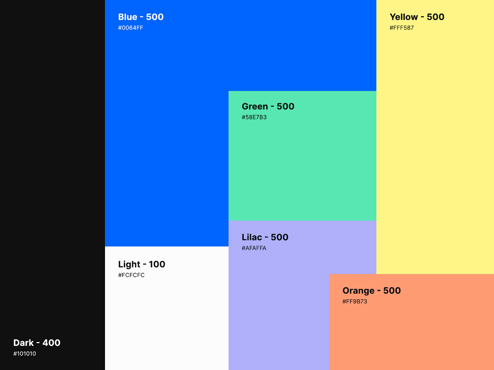
Primary colors
- Blue: This shade signifies trust, security, and stability, reflecting our commitment to reliability and assurance. Just as a clear sky imparts confidence, this blue hue enhances our brand's credibility.
- Black: The infusion of black conveys reliability, sophistication, and a wealth of experience. It mirrors our professional demeanor and extensive expertise, akin to a well-tailored suit symbolizing refined mastery.
- White: White brings simplicity, calmness, and purity to our palette. It embodies our dedication to seamless interactions, like a fresh canvas ready for engagement, ensuring effortless user experiences.
Secondary colors
In addition to our main colors of blue, black, and white, we also have a set of secondary colors: green, lilac, yellow, and orange. These colors work together to support and enhance our main palette.
- Green: It represents growth and balance, giving a fresh and lively feel.
- Lilac: This color adds a calm and creative touch, inviting introspection.
- Yellow: A cheerful and energetic hue, it brings positivity and brightness.
- Orange: Warm and inviting, orange adds excitement and a touch of adventure.
All these colors come together to create a complete and appealing visual style that embodies our brand's values and character.
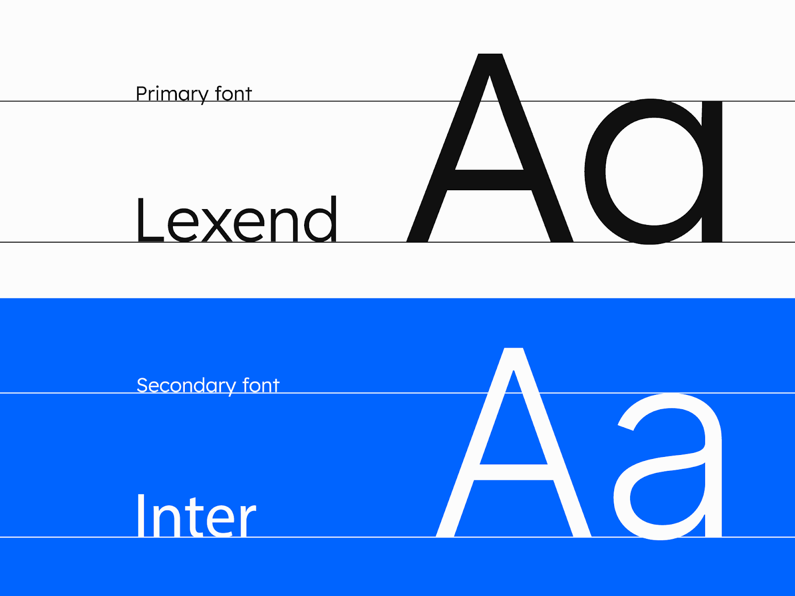
Typography
Intended to reduce visual stress and so improve reading performance. Lexend and Inter’s versatile nature allows them to appear sophisticated and modern, as well as inviting and friendly.
Logo design process
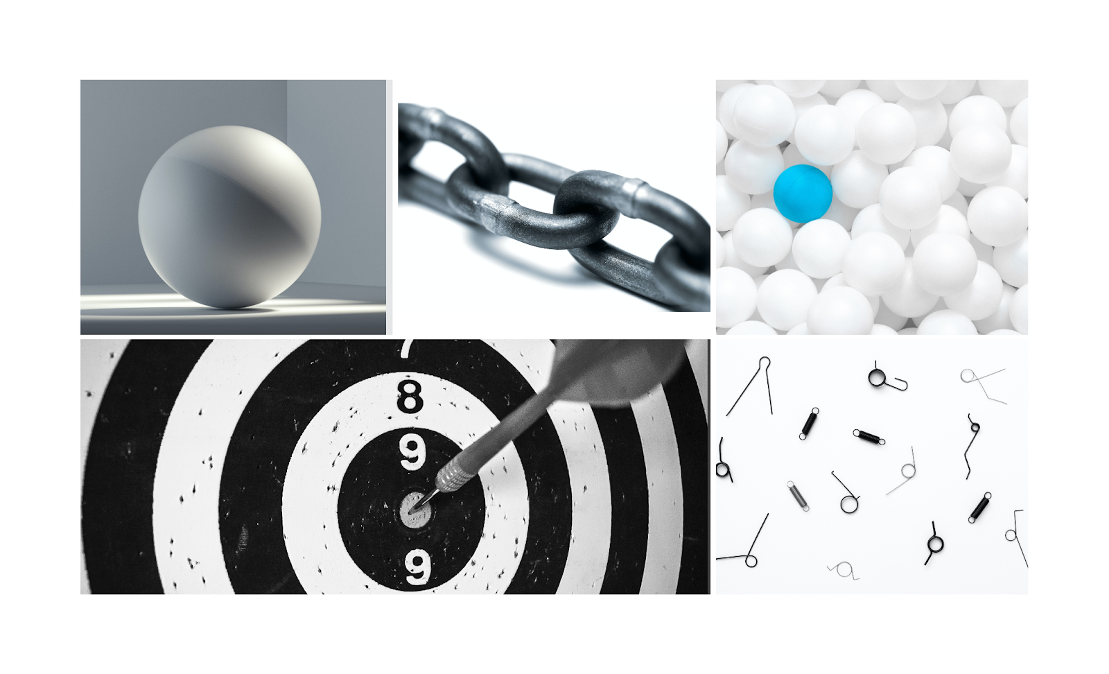
It all started with a clear goal: to reimagine the essence of the Neverinstall brand. To ignite our creative process, we plunged into a brainstorming exploration centered around the core identity of the brand.
Embarking on a voyage of creativity, we immersed ourselves in a brainstorming session, conjuring a diverse array of objects and concepts that truly capture the core of our brand. Our exploration spanned a spectrum of elements, including Browser, Globe, Circle, Wordmark, Bolt, Portal, and more.
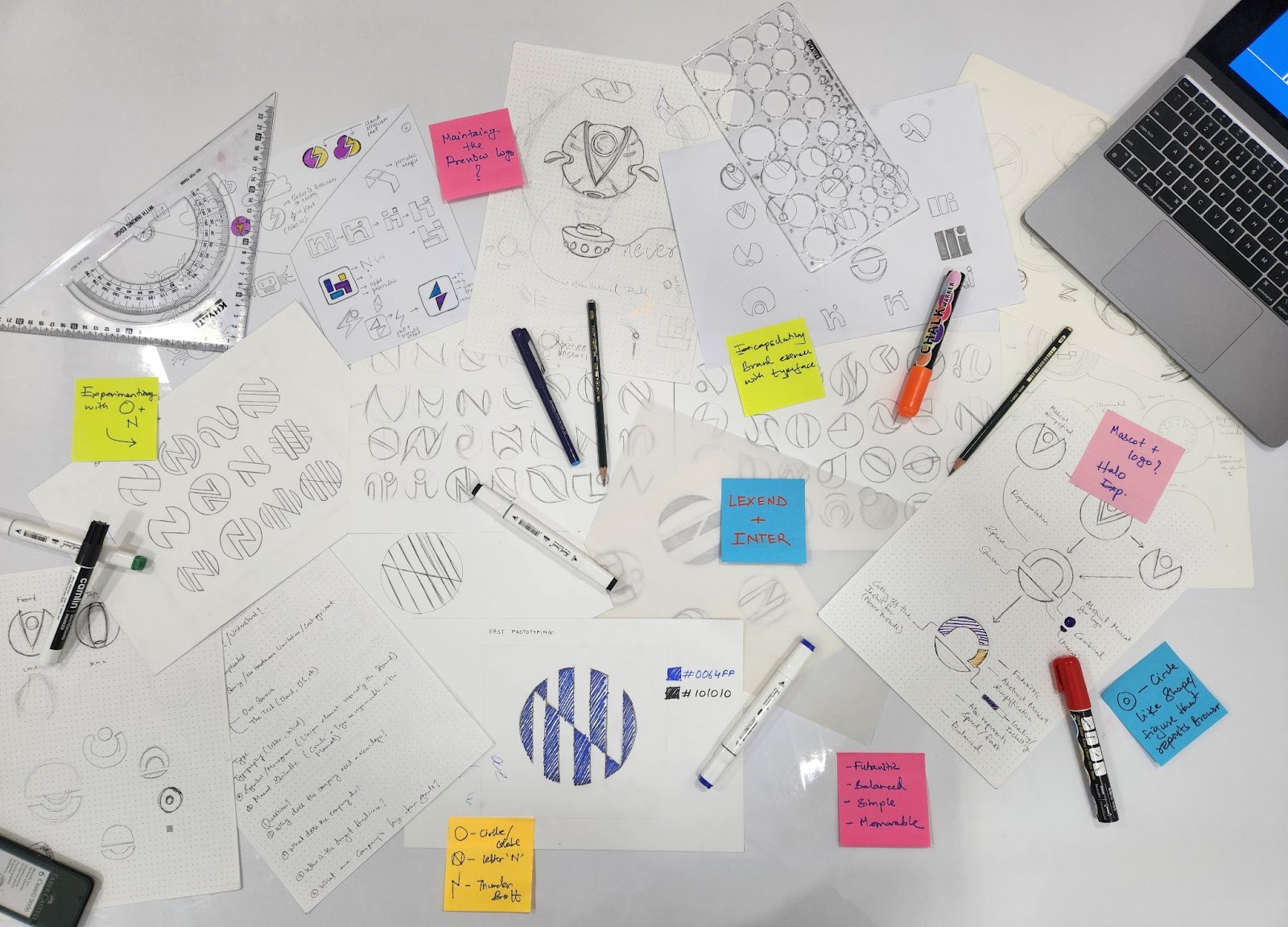
Logo making process
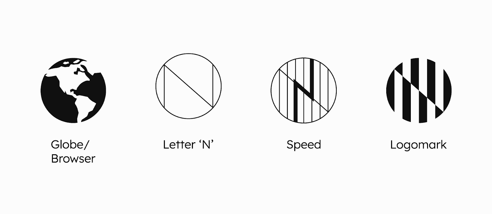
Building blocks
🌏 Globe: The globe represents global accessibility and a browser-based platform accessible from around the world.
🇳 Letter 'N': Symbolizing the very essence of the Neverinstall brand through its initial.
⚡Bolt: The bolt symbolizes the unmatched power and speed that Neverinstall delivers.
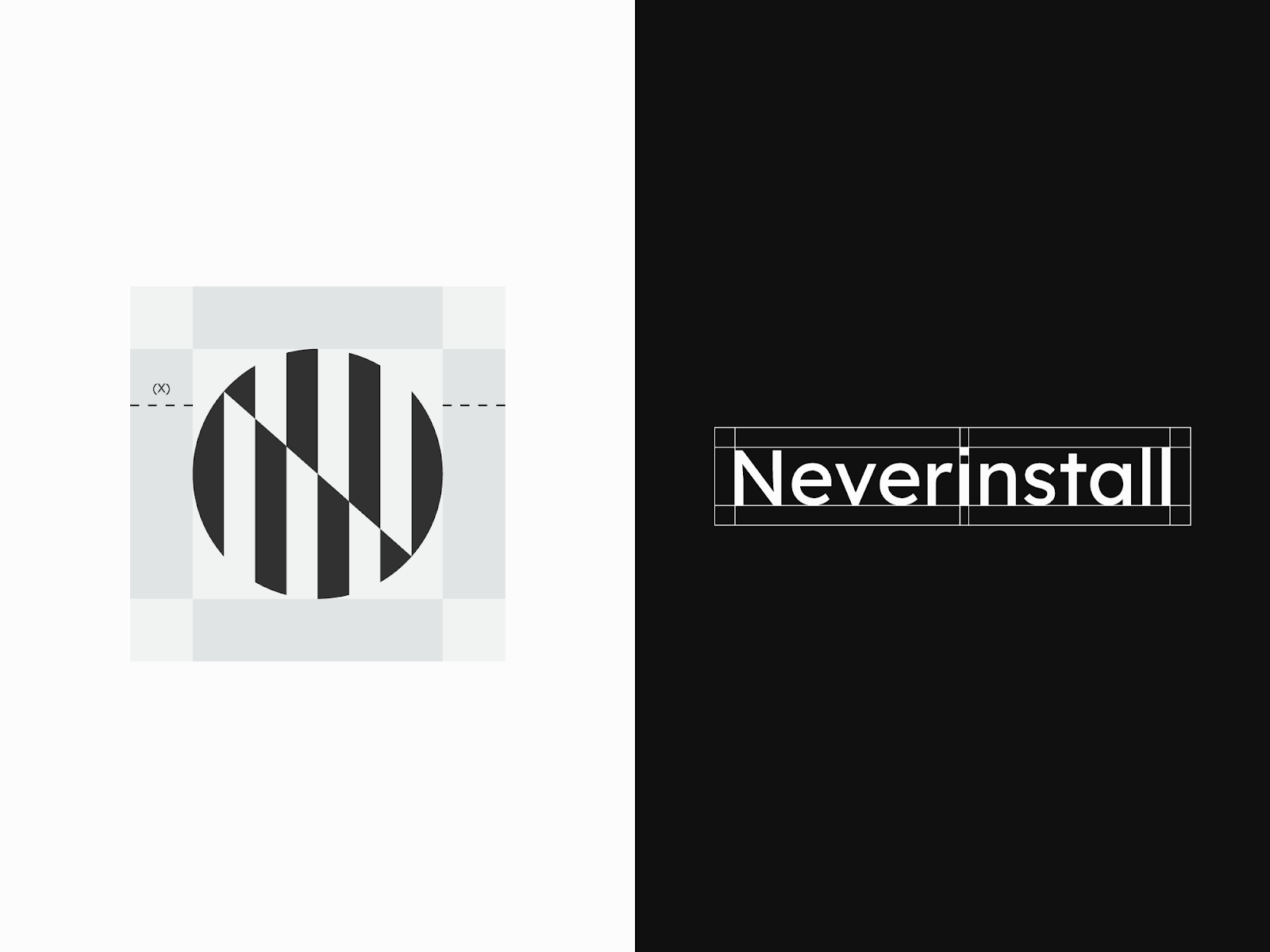
Logo Mark Breakdown
Distortion refers to a slight alteration in the way we perceive objects, making them appear somewhat different from their usual state. In this context, distortion is utilized to emphasize the letter "N." This effect is achieved by bringing together two lines that meet at a tilted angle of 40 degrees, effectively crafting the distinctive shape of the letter "N."
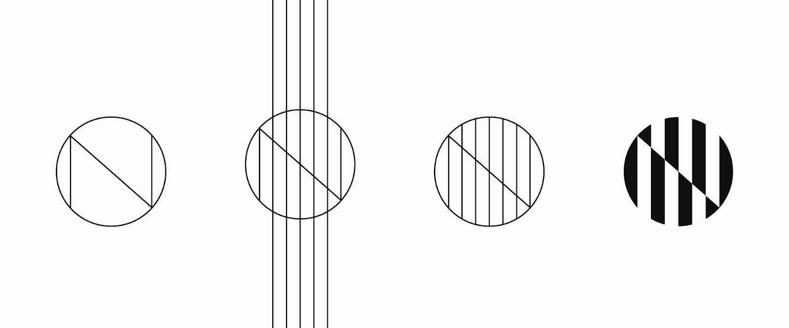
Circles carry the idea of never-ending existence, giving us a peek into the concept of endlessness. They represent ongoing connection and timelessness, encouraging us to think about things that last forever.
Vertical lines assume a bolt-like formation, symbolizing power and speed, while also guiding your gaze to readily identify the letter 'N' within the logo mark.
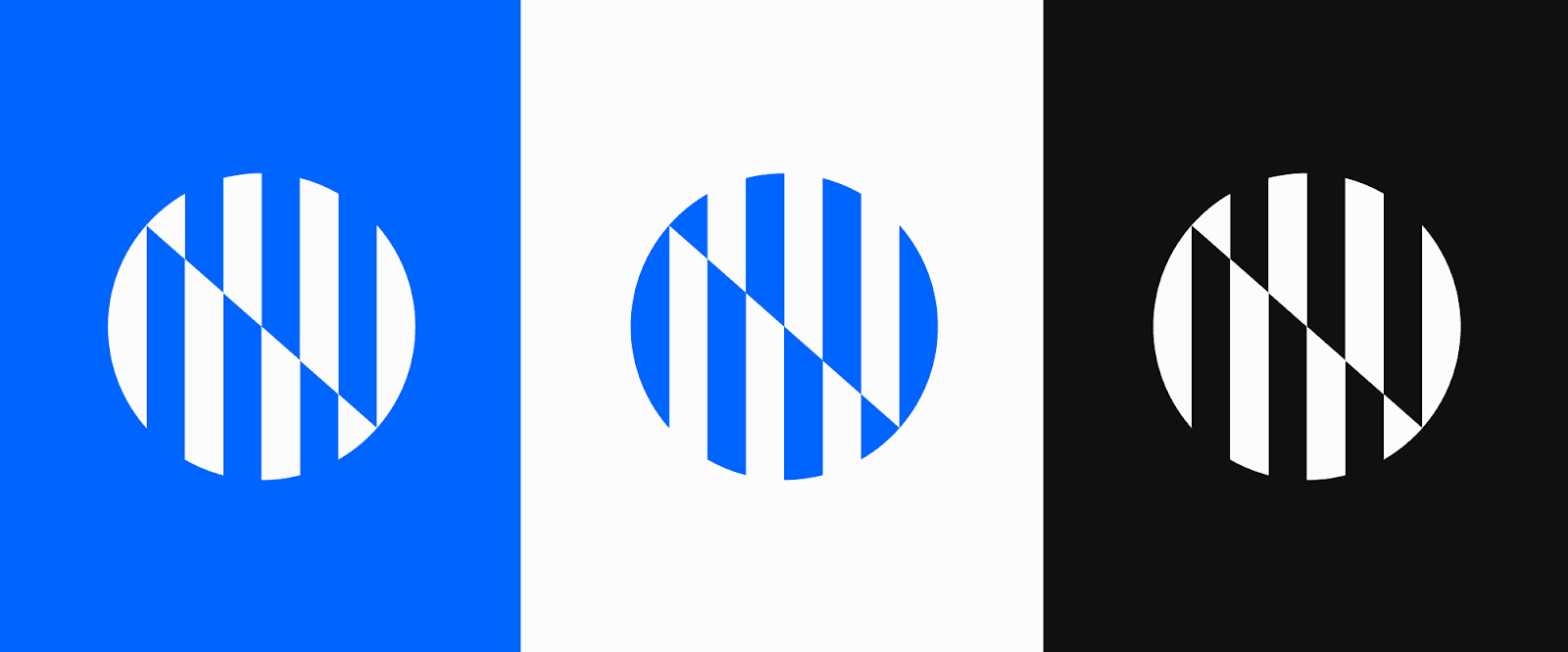
Logomark color variations:
The logo mark is showcased in three unique and distinguishable color variations. Each variation offers a different color scheme that enhances the visual appeal and versatility of the logo, allowing it to adapt and resonate effectively across various backgrounds, platforms, and contexts.
Final Logo
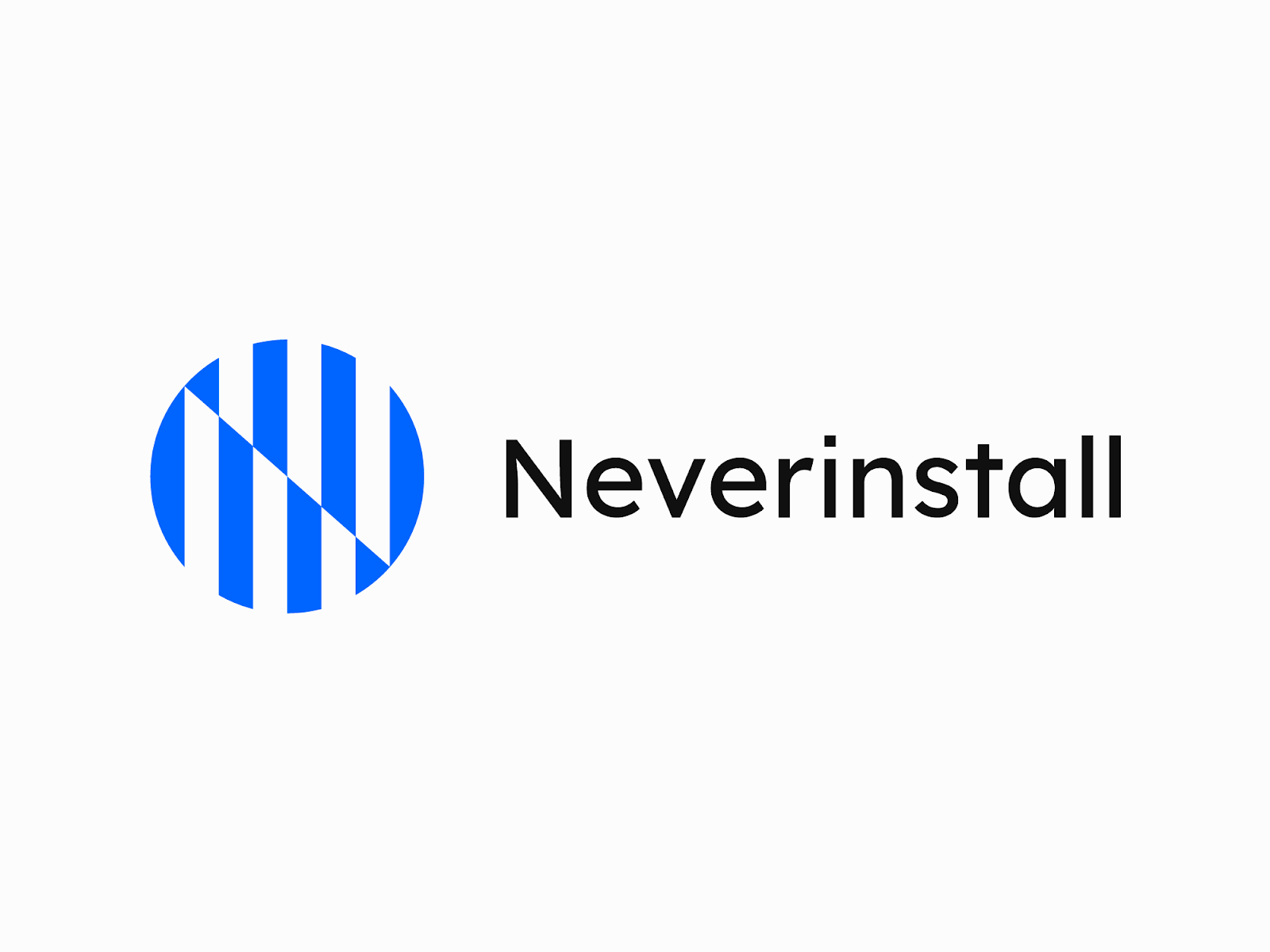
This fresh brand encapsulates many key values held dear by the Neverinstall team: a commitment to innovation & craftsmanship, a passion for creative expression, and an unwavering pursuit of excellence.